Eric Oakland Portfolio
TruScribe | BranD
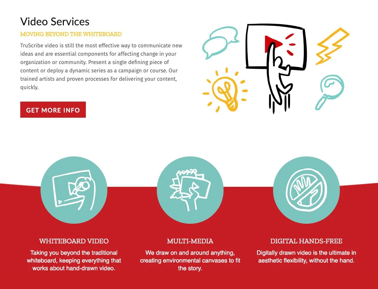
The visual style, branding, and messaging that launched a globally competitive video production company.
Identity and Design

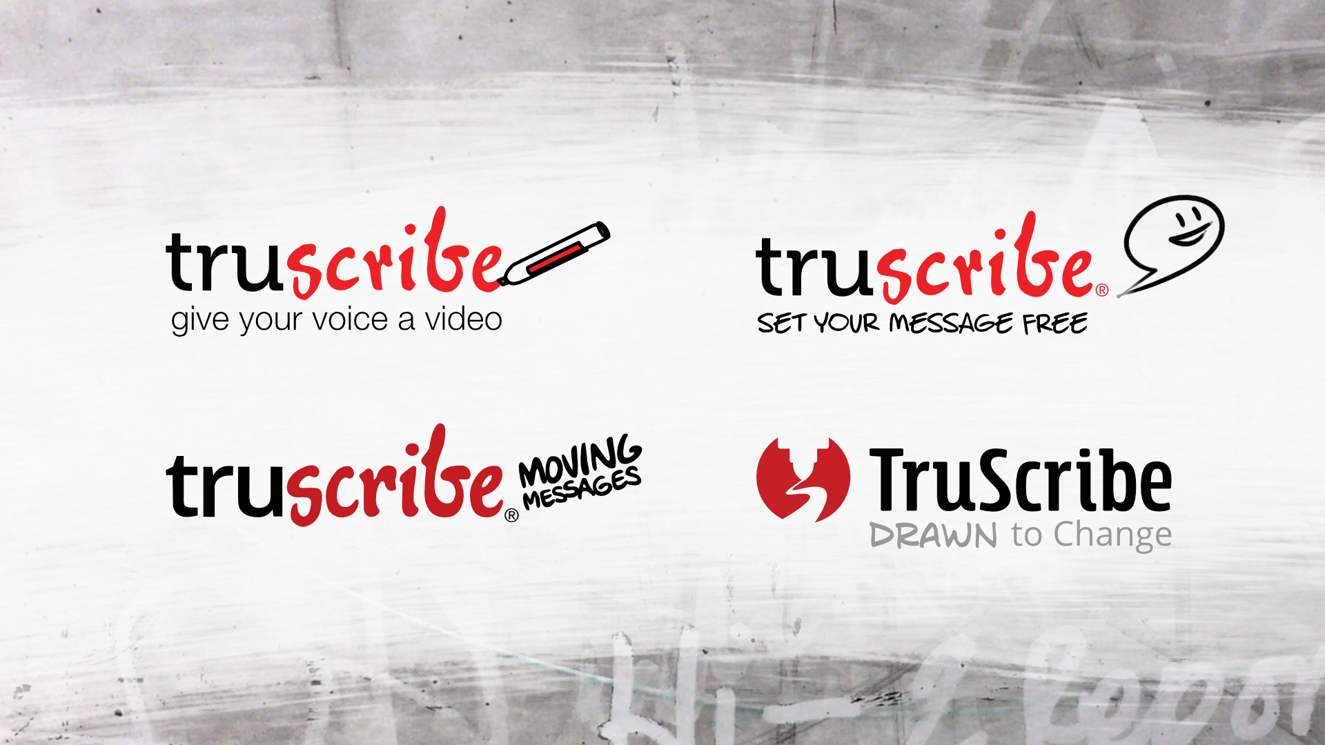
From 2011 to 2017, TruScribe’s word mark and logo stayed consistent. The exception to that was the tagline, which I changed to fit our evolving target markets. But I had always wanted to include an image mark to build a stronger visual association with the brand.
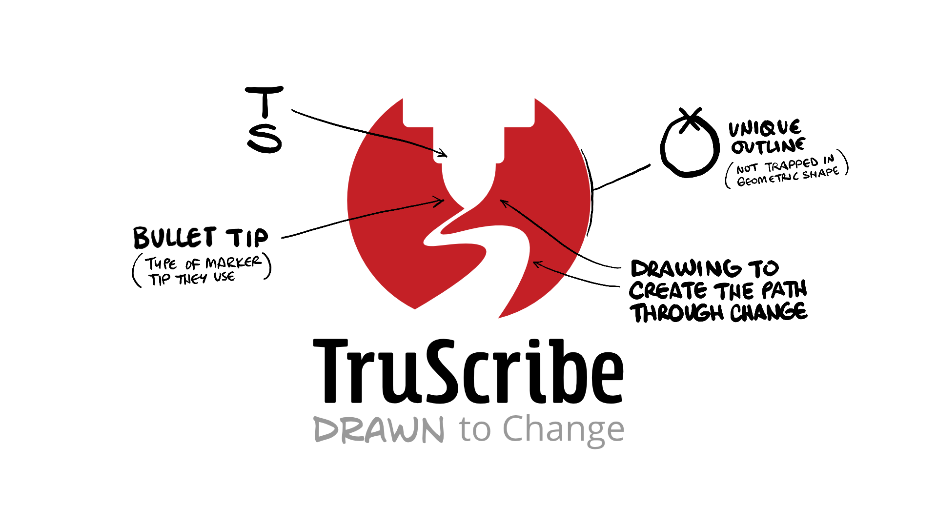
In 2018, as part of an expansion of services, I decided that it was time to include an image mark. Both the image mark and tagline represented the use of visualization to achieve a desired change while also communicating the team’s enthusiasm to be a partner on that path.
Messaging Creation
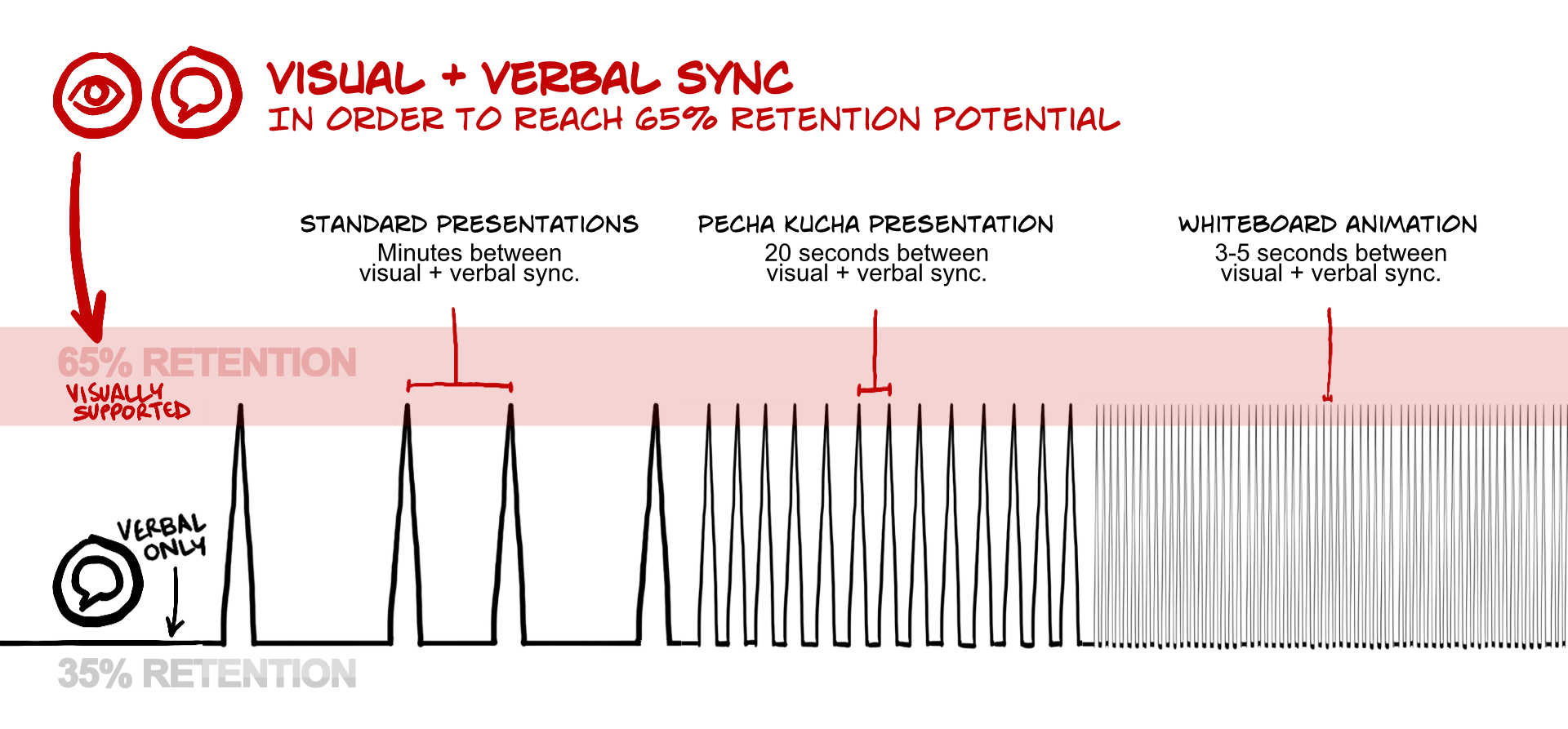
My first client was a psychologist studying the neuroscience of media, so I became curious about what aspects of human behavior drove the appeal and effectiveness of whiteboard animation.
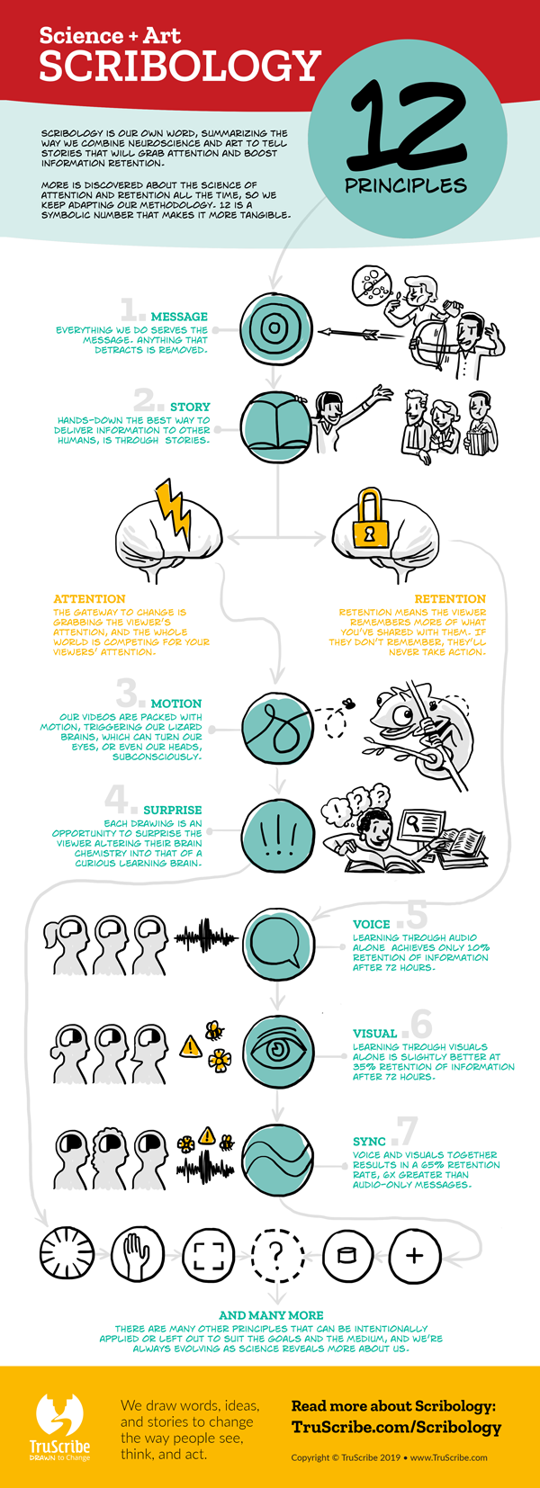
At the core of our messaging became an intersection of science and visualization which I coined “Scribology.” It showed the serious side of art, while making the science easy to communicate.

Visual style DevelopMENT
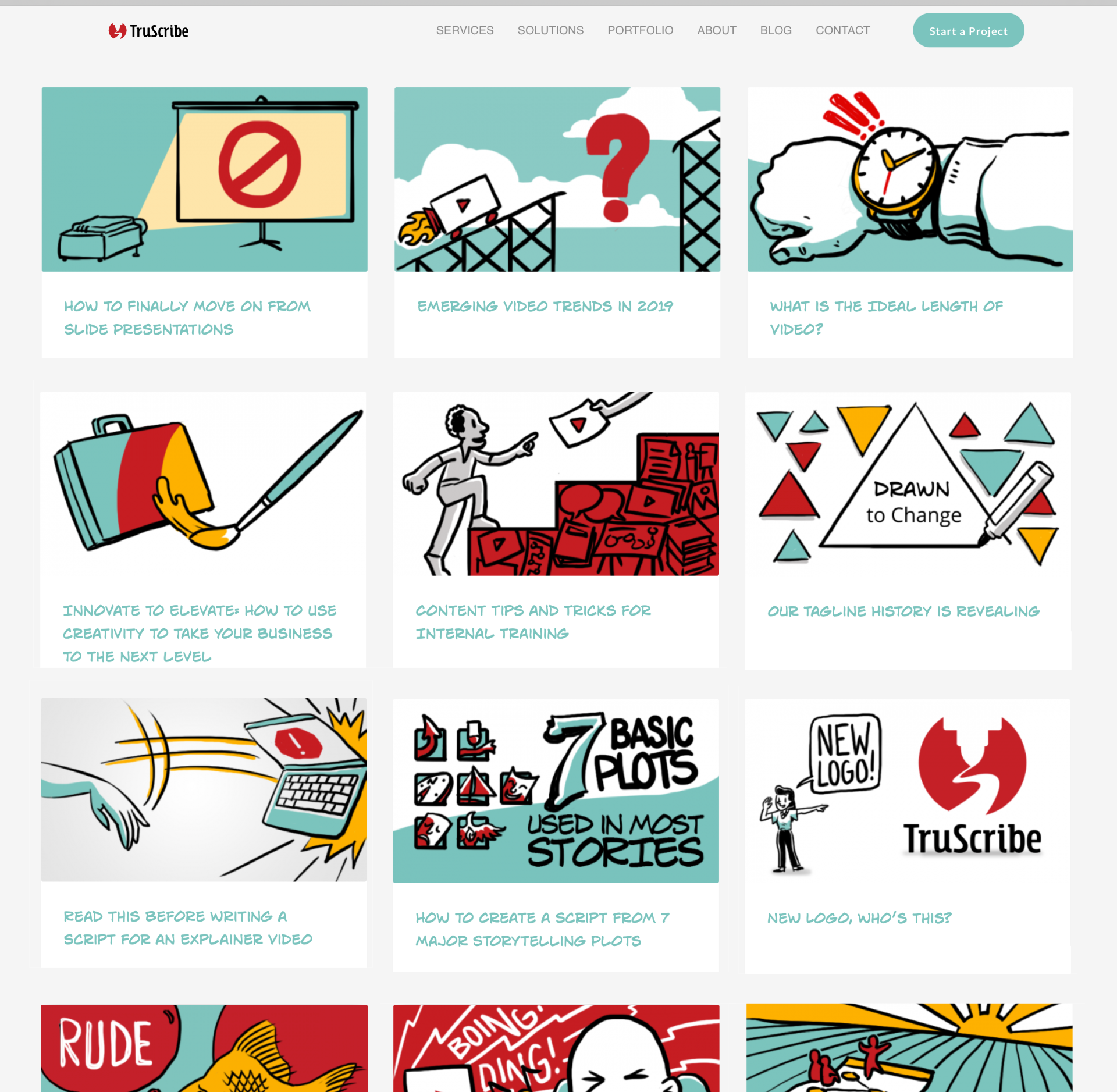
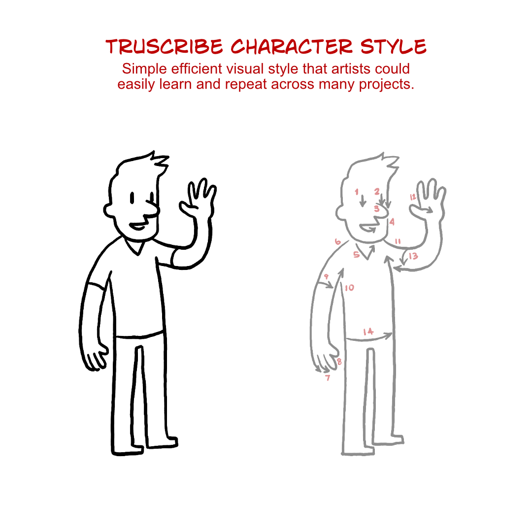
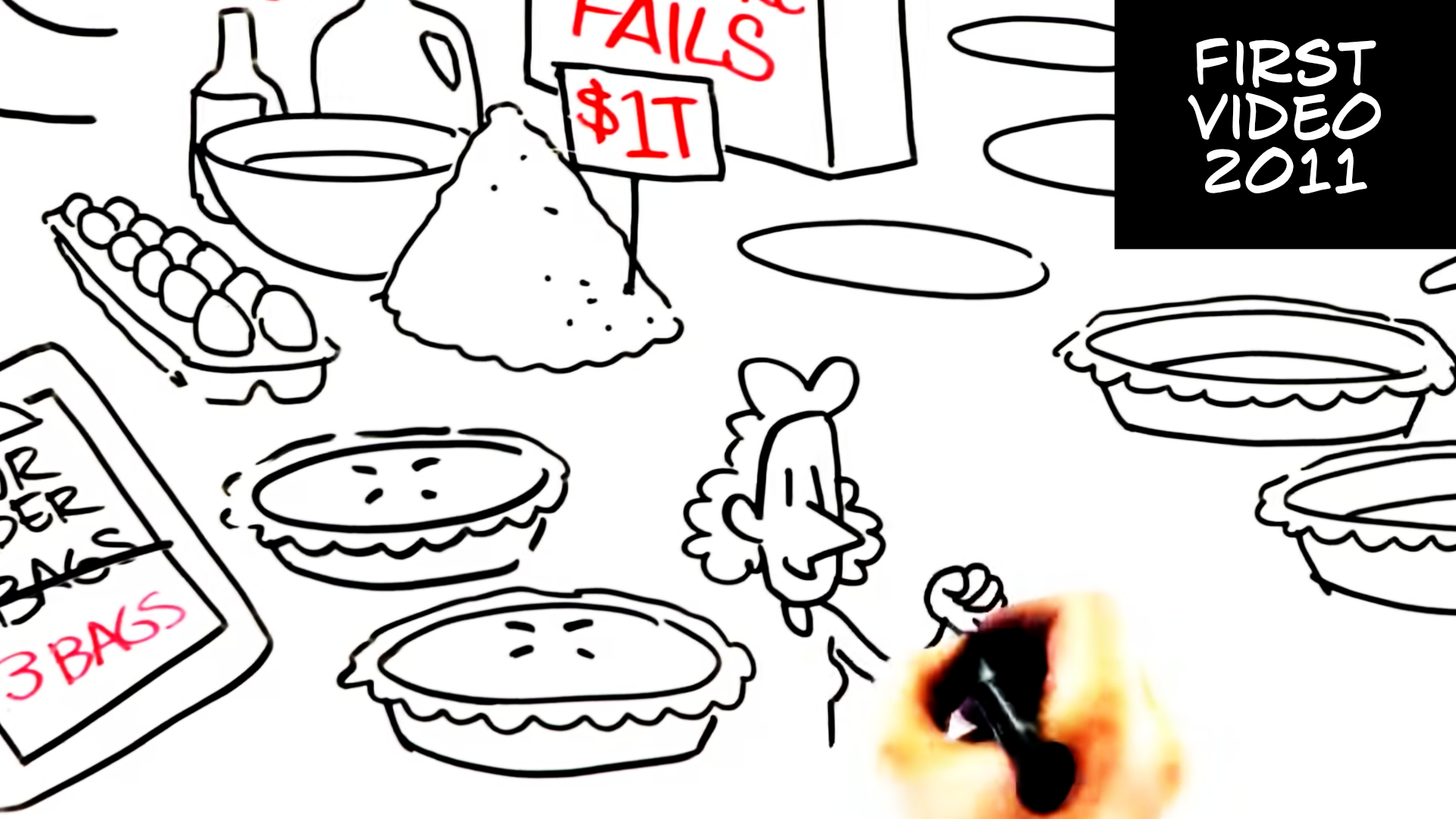
From the very first video, I knew I needed a standardized drawing style that was easy to deliver. It needed to be zoomed in with thicker lines, clear text, iconographic images, and unique characters. With this, I immediately had a foundation to build on.
These standards were essential for scaling and training new artists to deliver our signature style.
And by the time “Weird” Al Yankovic was looking for a whiteboard video partner for a music video, our style stood out as the epitome of the genre.


Creating and evolving the TruScribe signature style, the scribology messaging, and the identity system is one of the projects I’m most proud of. Most designers don’t get to work on a project like this over 10 years.

